
Antipodes
watercolour on Arches 640g cold-pressed paper
150cm x 100cm
private collection
framed in black velvet (shown at left)
This work was chosen by Penguin for the Penguin Classics 25th printing of William James 1902 book, The Varieties of Religious Experience. See other awards and bibliography
About the painting Home
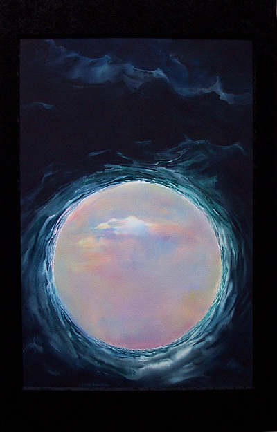
...the jewel-like Antipodes, literally meaning diametrically opposed, ...so far removed from England were they, this land, these 'other isles'. Almost akin to us (in our time) contemplating travelling to the moon or Mars, so distant and dangerous was the voyage back then when this word was plied to a distant land, ...so much was this place the subject of speculation, rumour, imagination.
The painting belongs in the genre of work I have come to call generic landscape. The spirit of the island continent is 'contained' in the serene compass of the circle, its heat and light, its expansive space distilled to the simplest possible means of expression I could find. Surrounding this dream-like light and space, is a powerful 'protector', mighty oceans, stretching their plying fingers around the circumference of this light-filled place.
Antipodes:...from England, to a place as far away as the diameter's poles, ...from clouded skies and long nights to bright days and starry nights, ...from the restless seemingly endless seas to the stillness and quietness of the ancient continent, ...new stories to be told, new songs, ...yet gradually finding their rhyme and rhythm rising and falling to the same pulse and Dreaming that was here first, as old as human time itself, ... this land, called Australia.
Technical, ...for the watercolour afficionados:
The dark indigo surround is 100% transparent watercolour painted wet-in-wet. No tricks, no inks, no acrylic, no pastel, no airbrushing, ... just basic watercolours and brushes were used, and of course, the all-important part of every watercolour, water itself.
The dark surrounding watercolour wash was one of the most challenging aspects of the painting especially in a work of this scale (150 x 100cm). The work had to be largely flat (or nearly so) during the painting, which meant that it was physically very demanding to reach and work across it. The dark washes (applied to wet paper) were extremely difficult to control on such a large sheet of paper. Although a heavy weight paper (640 gram), it had not been pre-stretched so that the paper surface, once wet, began to become like the surface of the sea itself. This contributed to uneven areas of wetness/dryness on the surface, which needed to be constantly monitored lest 'back runs' occur where they were not desired. To achieve the exquisite granulation of watercolour washes in which the texture of the paper is subtlely visible due to the sedimentation of heavier pigment particles within the tooth of the surface it was essential to allow the whole dark wash to dry very slowly. In slow- drying dark washes on an uneven surface it is extremely dififcult to avoid backruns since the crests in the paper dry first and the troughs remain damp much longer.
Darker tones (or values) in wet-in-wet technique are much harder to handle in transparent watercolour (especially in large-scale works) than lighter (paler) ones. (Have you wondered why you hardly ever see large and predominantly low-key watercolours? It is because rich vital soft-edged darks are so very hard to achieve in this medium.) It must be remembered that in transparent watercolour, the more water added to the pigment, the lighter in tone or value the resultant effect will be. Secondly, watercolour dries about 10 -15% lighter (paler) than it appears when wet. Thus to get a rich saturated wet-in-wet very dark value on a large scale requires a balancing between two extremes. On the one hand, enough water is needed to soften edges and to allow the pigments to diffuse and intermingle in that beguiling watercolour way, (and in order to avoid, by the same token, a gummy, lumpy, scratchy effect which indicates too little water), and on the other, this ratio, the relative amount of water-to-pigment, needs to be kept to an absolute minimum in order to achieve the rich velvety dark values desired (otherwise the excessive amount of water will render the pigment more and more transparent, and since the ground of the paper is pure white, an increased transparency would lead to a less-saturated more palid result) When working onto wet paper (wet-into-wet) there is a double-dilution effect in play: water on the paper surface is diluting the tone or value of the pigments, so too the water in the brush. The brush is always charged with water first. Water is the very medium of watercolour.
These were the difficulties. But there was another. The wetness of the paper had to be progressively and circumferentially adjusted in the critical area approximating the circle: I did not want a 'cut-out' effect with a hard edge. I wanted there to be an atmospheric 'filmy' transition into the light and space of the circle. This meant the circle's outer edge needed to be kept just damp, but not too wet. The waves had to be painted while the paper was wet, and the wetness of the whole sheet required constant monitoring, at all times painted into with a brush whose dampness needed continual adjustment in relation to the wetness of the very-slowly-but-steadily-drying heavy-weight paper.
The luminous centre was achieved through sequential thin glazes of the primary colours.
W. Roberts
Homepage of this web site | more watercolours | landscape responses to Australia | inspired by history, science, math | a new way of painting light | awards | exhibiting | contact